Use Colour Contrasts to Highlight Your Favourite Elements


Use Colour Contrasts to Highlight Your Favourite Elements
Colour is one of the most powerful tools when it comes to creating mood, balance, and focus in your home. But it’s not just the colours themselves that matter – the contrast between them plays a key role in how a space feels. By using colour contrasts thoughtfully, you can draw attention to your favourite elements, add depth, and give your home a personal touch. Here’s how you can make colour contrasts work beautifully in an Indian context.
What Is Colour Contrast – and Why Does It Matter?
Colour contrast is the difference between two colours. The greater the difference, the stronger the contrast. High contrast creates energy and draws attention, while low contrast brings calm and harmony. When you want to highlight a particular element – a painting, a piece of furniture, or a decorative object – contrast is your best friend.
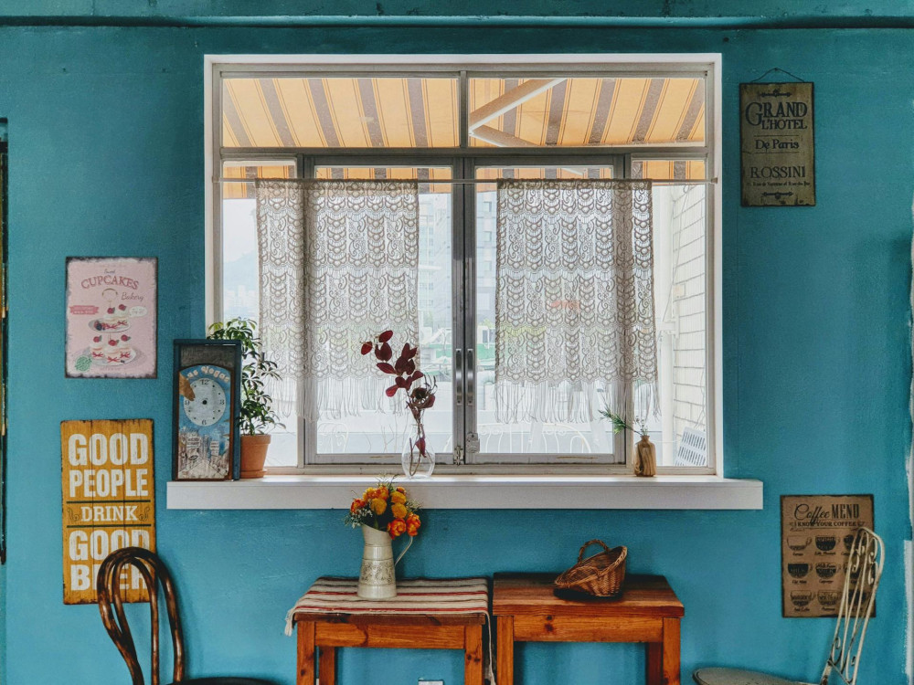
Think of how a bright brass lamp stands out against a deep teal wall, or how a vibrant cushion enlivens a neutral sofa. The contrast makes the eye pause and notice the detail.
Use the Background as Your Canvas
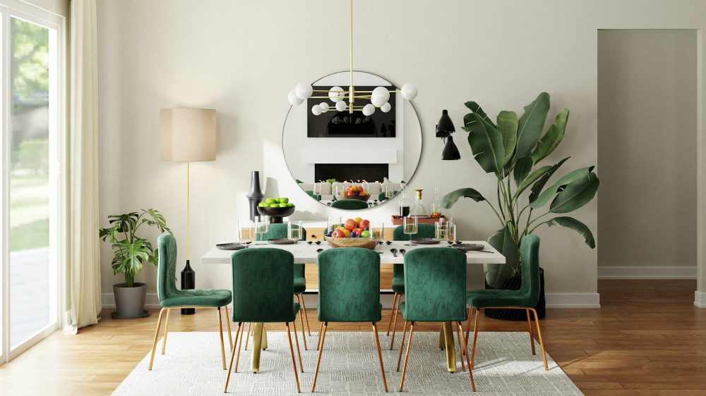
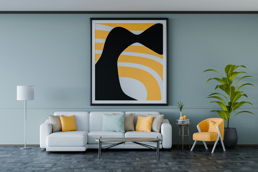
Walls are the easiest place to start when working with contrast. A neutral wall colour like off-white, beige, or soft grey provides a calm backdrop where colourful elements can shine. On the other hand, a bold wall colour can make lighter or metallic objects pop.
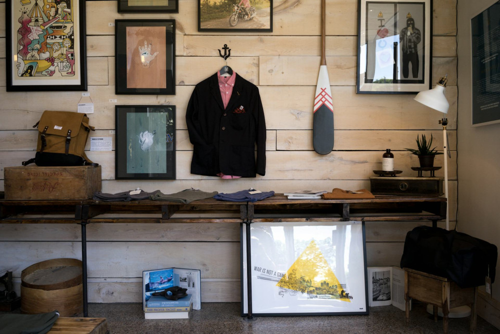
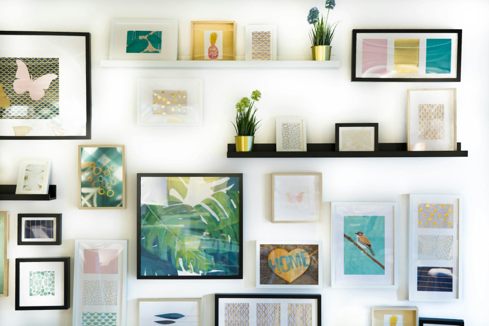
- Light background + dark details: Creates a classic, elegant look.
- Dark background + light details: Adds drama and depth.
- Coloured background + complementary colour: Brings energy and a modern edge.
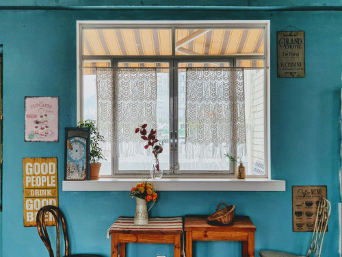
For example, if you have a painting with warm red and orange tones, a cool green or turquoise wall can make those colours appear even more vivid – a combination often seen in traditional Indian crafts and textiles.
Balance with Textiles and Accessories
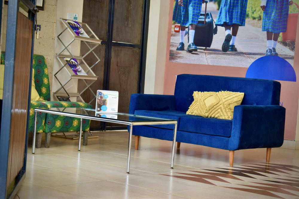
Colour contrasts don’t have to be loud to be effective. Small details can make a big difference. Cushions, rugs, lamps, and ceramics are perfect for experimenting.
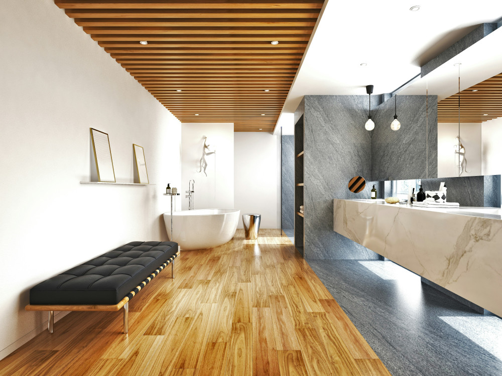
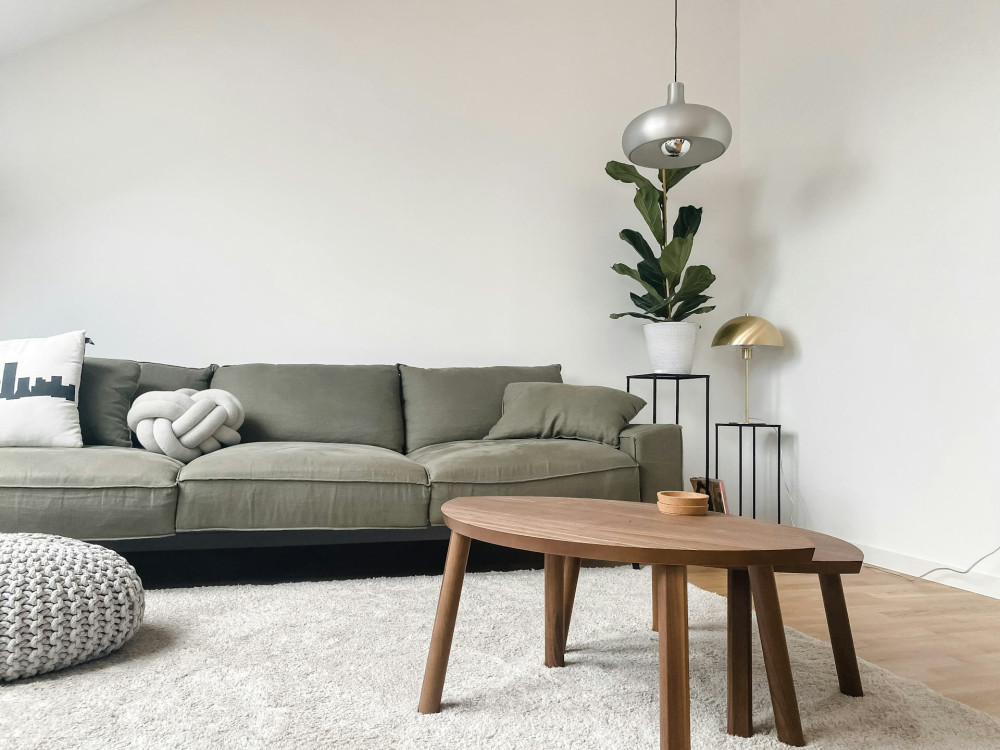
Try mixing materials and colours that play off each other: a mustard cushion on a navy armchair, or a terracotta vase on a marble tabletop. These small visual pauses give the eye something to rest on – and something to discover.
A good tip is to repeat the same contrast in several places around the room. This creates a sense of harmony and makes the space feel intentional.
Læs også:

Use Light to Enhance the Contrasts
Light has a huge impact on how colours appear. In India, natural light changes dramatically throughout the day – from the soft morning glow to the golden evening hue. Artificial lighting can either soften or intensify contrasts. If you want to highlight a particular element, consider giving it its own light source – a spotlight or a lamp with a warm tone.
A painting, a sculpture, or even a potted plant can come alive when lit properly. You can also use lighting to create contrast between spaces: a bright, airy living room and a more subdued, cosy bedroom bring variety and atmosphere.
Don’t Be Afraid to Experiment
Colour is personal, and there are no strict rules. The key is to experiment. Paint small test patches on your wall, move your furniture around, and observe how the light changes the colours during the day. Sometimes the best contrasts happen by accident.
If you’re unsure, look to nature for inspiration – India’s landscapes are full of harmonious contrasts: the golden sands of Rajasthan against blue skies, the lush green of Kerala’s backwaters beside red-tiled roofs, or the bright marigolds against white temple walls. Nature’s palette is a perfect guide to what feels balanced and alive.
Make Contrasts Part of Your Style
Once you start working consciously with colour contrasts, you’ll see how much they can transform a space. They can make a neutral home feel more personal, or bring structure and calm to a colourful one. It’s not about following trends, but about finding the balance that suits you.
So next time you bring home a handcrafted vase, a painting, or a piece of furniture you love – think about what background and colours will make it stand out. With the right contrast, your favourite elements won’t just blend into the room – they’ll become the heart of it.
Læs også: